Visualizations
Here are some visualizations of what the detections look like.
Plaza Metrics
Average Number of People in the Plaza
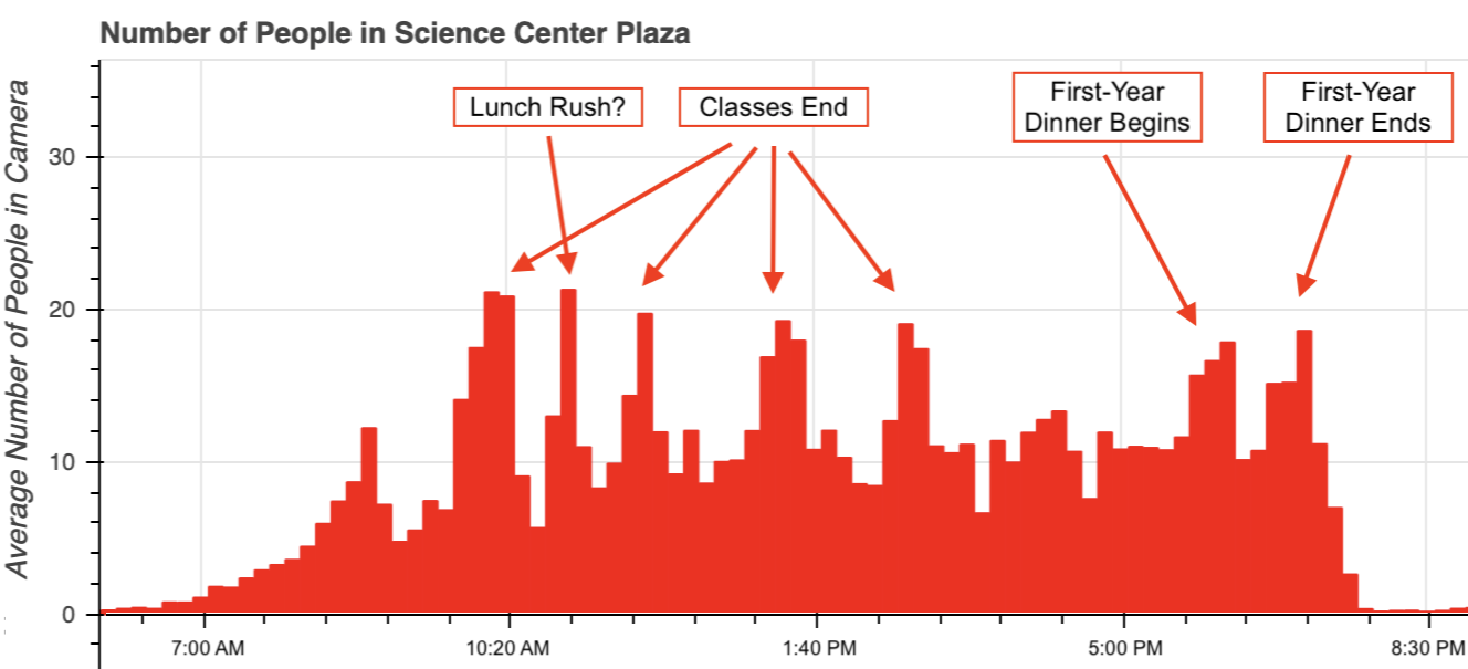
Ever wonder when people are around the plaza the most? We’re able to see when people start moving around the square, and how many people are moving at any point in time. For example, here is a bar chart for the average number of people per frame in the plaza, while aggregating with a window of 10 minutes for Wednesday, April 10. We are able to identify interesting features, such as when classes start and end and popular meal times.

If you want to explore a subset of the data yourself, check out this interactive graph. There are a few icons on the right side of the graph for the controls. When every control is toggled, you can use your scroll wheel to zoom in or zoom out, and click and drag to move the graph around. Furthermore, you can get a detailed timestamp and information by hovering over the individual bars.
Hotspots
How does the distribution of people in the plaza change over time? Check out the heatmap of where people are standing in the image here. This is just the how the distribution of people in the plaza evolves over the day. The specific day depicted in the video was April 10, 2019.
We see that in the mornings, the distribution is relatively uniform along the plaza, and people occupy the location of the food trucks until they arrive in the late morning (closer to 11 AM). Then, we can see the different paths through the plaza light up as students try to get to class, and also the paths taken by tourists. We also see hotspots at the food trucks around 1 PM, from people eating lunch.
Looking at the Detections
It’s also nice to be able to look at the detections themselves. We are able to get the detections and plot different classes (such as people or trucks) to check if the detections are reasonable.
Historical Data
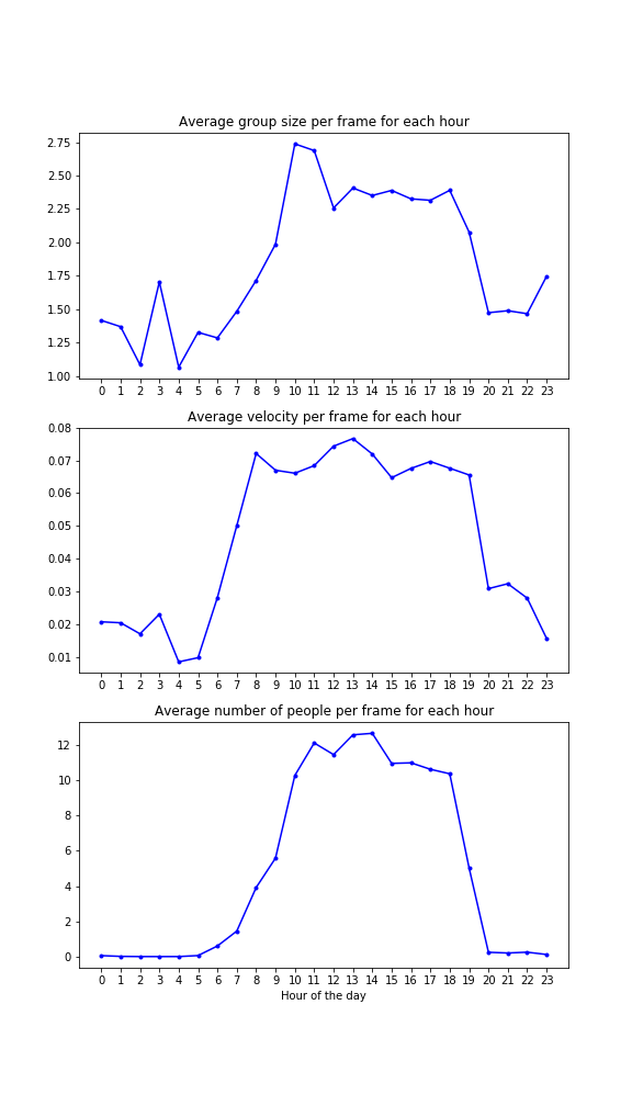
Once we analyze the video recordings in the science center to identify objects, we are able to get historical averages of common statistics like number of people, velocity, and group size, and alert the user if current conditions differ greatly from historical averages. For comparing our streaming analytics with history, we averaged all of the statistics over hour periods and compare. In particular, we aggregate our historical data based on the starting hour (from 0 to 23), and then compare the streaming analytics per-frame to the historical data for the corresponding hour of the stream. The streaming system produces an alert if any metric exceeds 130% of the historical average. The statistics over each hour period for the month of April are shown below. We note the popularity during the middle of the day for each metric (average group size, average velocity, average number of people).

Then, using these historical averages, we alert the user when our livestream metrics exceed the historical average by at least 30% in any of the metrics. Here is an example of the alert system:

